
 In the rolling hills of Tuscany within the province of Siena is the town of Montalcino. Formerly on hard economic times, Montalcino’s
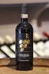
  decline was reversed by the popularity of the town’s famous wine, Brunello di Montalcino, made from the sangiovese grapes grown in the area. The number of wine producers in this area grew from 11 in the 1960s to more than 200 today.
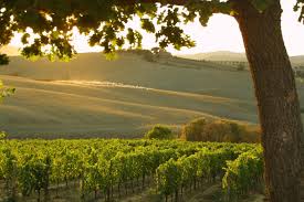 But one of the vineyards, Il Paradiso di Frassini, is decidedly different. The grapes are serenaded all day, every day, by classical music. The experiment is the brainchild of Giancarlo Cignozzi, the owner. In 1999, while he was practicing law in Milan, he discovered a crumbling estate for sale just south of the town of Montalcino. It was a humble place—with a house, farm buildings and vines all in disrepair. But it was near some of the top Brunello wineries, and Cignozzi fell in love with it.
 Cignozzi farms the vineyards organically. But he is also a trained musician, and he was inspired to combine both passions—playing music and creating an organic vineyard. He asked himself, “if
  music can improve the lives of humans and animals, why not plants?” So he started playing Mozart in his vineyard. And he got results. According to his son, Ulisse, they divide the vineyard into 25 areas and monitor the quality of the grapes at harvest time. The plants near the music are more robust. The grapes that grow closer to the speakers have a higher sugar content.
It wasn’t long before the idea caught the attention of scientists. Stefano Mancuso, a plant neurobiologist from the University of Florence, who has been studying the vineyard since 2003, says, “It’s very difficult to say that plants like classical music…but they can perceive sounds and specific frequencies.” He speculates that Cignozzi’s vines may grow toward the speakers because the music frequencies resemble those of running water. He also believes that the sound reduces insect attacks dramatically. Music may confuse harmful bugs, making them unable to breed. The music may also scare away birds and other creatures that feed on grapes.
 While Cignozzi is proud of the research, he is also an incurable romantic. He prefers the Mozart vision over the theory of vibrations. He’s been serenading his grapes for over a decade and stands by his decision to play Mozart. Mancuso says that they can play many other types of music—even heavy metal if it has enough bass. The vines are affected by low frequencies.
And how does the wine taste? According to my Santa Barbara friend, fellow Italian 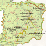 language student, and wine expert, Joel Garbarino, “Brunello is a great wine with hints of cherry, spices and mineral, and even mushrooms…and as my Italian friends say, “a touch of lead dust’”. Joel sent me this map, which shows the seven zones of wine producers around Montalcino. Paradiso di Frassini is in the Montalcino Nord zone.
Brunello was the first wine to be awarded the Denominazione di Origine Controllata e 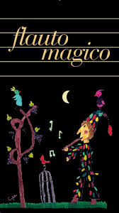 Garantita (DOCG) status. Brunello di Montalcino must be aged five years prior to release. But what about the Brunello wines from Paradiso di Frassini? According to the web site, there is a special wine called “The Magic Flute”: “This is a unique and inimitable Brunello. From 2008, thanks to Bose (the consumer electronics company), we were able to play music to one of our Brunello vineyards (comprising 1 hectare or 1.47 acres), using 50 loud-speakers, which we placed along each vine row. We then made sure that the Brunello grapes from this “Mozart vineyard” were fermented separately in our winery. We decided to leave the wine from these fortunate Brunello grapes in the barrel for 8 months longer than normal. This is how Paradiso di Frassini’s first “cru” was born. So immersed in musical harmony, we called it ‘The Magic Flute.’”
 per l’illuminazione notturna. Da allora, i crimini in queste aree illuminate sono sensibilmente calati. Lo stesso esperimento è stato condotto nel 2005 in alcuni quartieri di Nara, Giappone. Il risultato? Furti, rapine, e aggressioni sono diminuite del 9% nelle strade illuminate di blu. Dal 2009 queste luci sono state sistemate anche in molte stazioni ferroviarie nipponiche, con l’intento di ridurre i tentativi di suicidio.
 Rosso, d’altra parte, è il colore che più di tutti cattura la nostra
 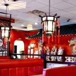 attenzione. È il colore dei segnali di stop e del sangue. Accelera il metabolismo, fa aumentare pressione e battito cardiaco. Per questo motivo fa crescere anche l’appetito, spingendoci a mangiare più velocemente. Quindi, l’arredo interno e il packaging di molti fast food e ristoranti cinesi sono dominati dal rosso.
 Il colore determina per l’80% la riconoscibilità di un marchio. Ciò che
  viene in mente è il rosso nei loghi per Coca Cola e per la auto Ferrari. Ma se una società sta per lanciare un nuovo prodotto, un sito, o una start-up totalmente innovativa, è preferibile optare per una tonalità di colore poco usata o non immediatamente associabile a un altro brand.
 Le tinte sottotono sono anche importanti. È più facile fermarsi—e acquistare—in un negozio arredato con toni freddi piuttosto che in uno
 spazio con le pareti rosse. Nero, e nero e bianco, comunicano valore, prestigio, durevolezza, e sofisticatezza di un prodotto. Molti dei marchi di moda di eccellenza italiana sono in nero e bianco—Armani, Gucci, Versace, e Dolce e Gabbana.
 I colori più usati dai 100 brand più popolari al mondo sono blu
  (nel 33% dei casi), rosso (29%) grigio o nero (28%) e giallo o oro (13%). Il 95% delle grandi marche utilizza solo uno o due colori nel proprio logo. Ma nelle più grandi “piazze” online, le sfumature di blu e azzurro sono praticamente il doppio di quelle di giallo e di rosso, e quasi il triplo
  di quelle verdi. Il blu è il colore che predomina su Facebook, Twitter, Google, Tumblr, Skype, LinkedIn, Wikipedia, e l’elenco continua. Icone gialle e arancioni sono spesso utilizzate sul web per invitare a comprare, sottoscrivere un abbonamento, o vendere online. E le icone rosse, che comunicano un senso di urgenza, sono utilizzate nei negozi online per prodotti in saldo.
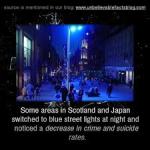 nighttime illumination. Since then crimes in those areas fell significantly. The same experiment was tried in 2005 in some neighborhoods in Nara, Japan. The result? Theft, robbery, and assaults decreased 9% in the streets illuminated in blue. Since 2009 these lights were installed in many Japanese railway stations, with the objective of reducing suicide attempts.

